VoxGuru
UX revamp for Voxguru - a music-learning application

Project Role: UX Designer (Generalist)
Client: Voxguru
Target Users: Classical music learners, Karaoke singers, Bathroom singers, Non- Indian classical music admirers
Challenge: Redesign an existing music-learning app to make the learning experience more immersive to the users, giving them the drive to learn, thus enhancing business.
Solution: Voxguru 2.0 is an application that not only actively involves the user to learn music but is also compassionate and motivating.
Research
Upon receiving the prompt, we were aware of the complexity that the experience we need to refine revolved around music and imparting musical knowledge.
Our primary focus was to find answers to these questions:
- Identify Drawbacks and user pain points of the existing version.
- How can the value proposition be improved?
- What does a music student seek?
- How do we keep the users motivated?
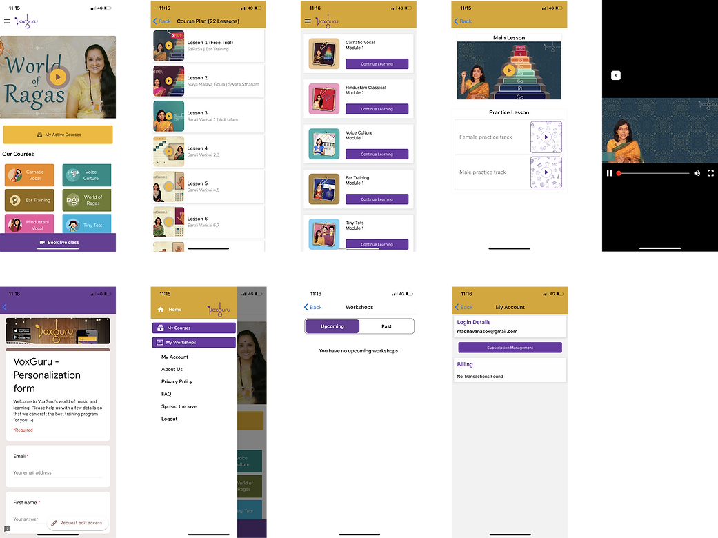
We began by analyzing the existing interface to find out what was lacking.
Preliminary Survey
We conducted a preliminary survey to gain insight into what the existing experience is lacking. The survey questioned users about their interests in learning music, their view about the authenticity of a music learning app, and what they felt about paying for music lessons online.
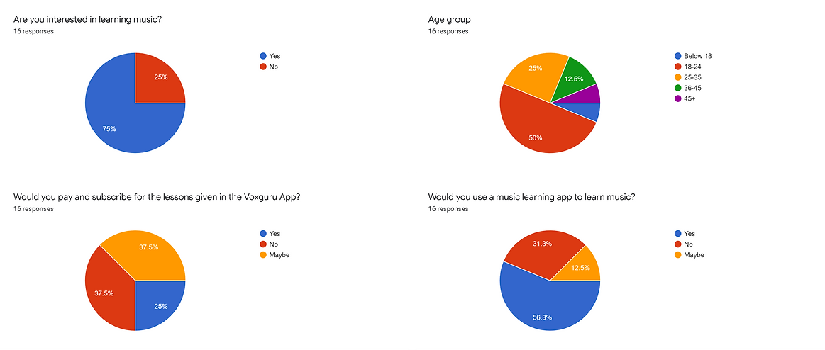
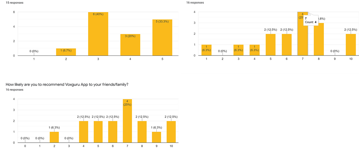
Insight: The survey results were contradicting and were uncertain to some extent. We concluded that we need more tapered and crisp understanding.
Interviews
We held 15 interviews with personas ranging from students, working adults, and senior citizens with almost half of them having a history in music. Our aim was to obtain in-depth qualitative responses regarding aspects that diminished the potential of the existing app.
Many participants felt that they did not feel involved in the experience that the current app provided.
“I’m not sure if learning music through online lectures, let alone through a mobile phone, would be efficient
when it comes to a new learner.”
- participant
“The teaching method is almost entirely passive. I’m almost sure that I would lose motivation and drop it along the way.”
- participant
“I have learned little music in my childhood and I installed this app in hope of catching up to my old skills. But I didn’t feel like subscribing to the courses they provided.”
- participant
Insight: We learned that the experience we are to build needs to be not only motivating and immersive but also compassionate as well.
Conclusion
The current version lacked desirability, has a meager value proposition and mainly it provides a passive learning experience that discourages the user to continue. Apart from this, we were able to identify numerous pain points in the existing app which we had to refine into flawless experiences.
Insight: Users need the motivation to keep themselves going and an active and immersive learning experience will keep them intact. Also, we understood rather than people with an inclination to music, we should target them based on the aspiration to sing.
Visual Design
In order to set the mood of the app, product personality was defined:
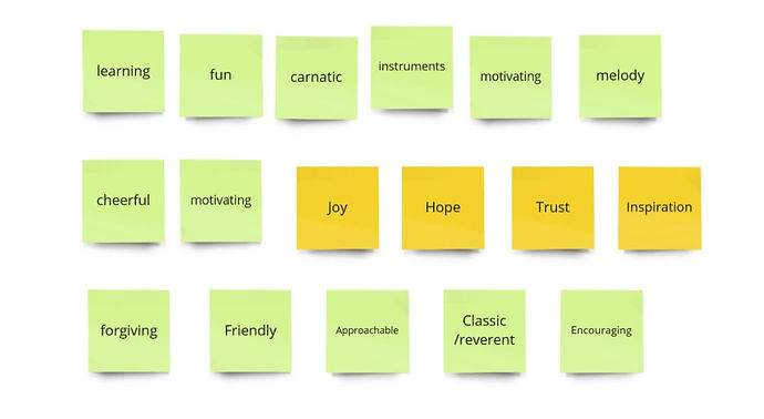
Voxguru is a motivating coach that cheers users to achieve the set goals. The product is also compassionate and wants to help users if they fall short of their goals. It should evoke a feeling that the users can do this.
“Vox guru is your favorite teacher. She is fun and caring. She is very knowledgeable and keeps you inspired to learn more. She is the guru that you trust and brings out the best in you.”
Furthermore, brainstorming sessions were conducted to identify the different feelings that the app should evoke.
Colour Scheme
After some iterations, the following mood board was considered for the color scheme of the app.
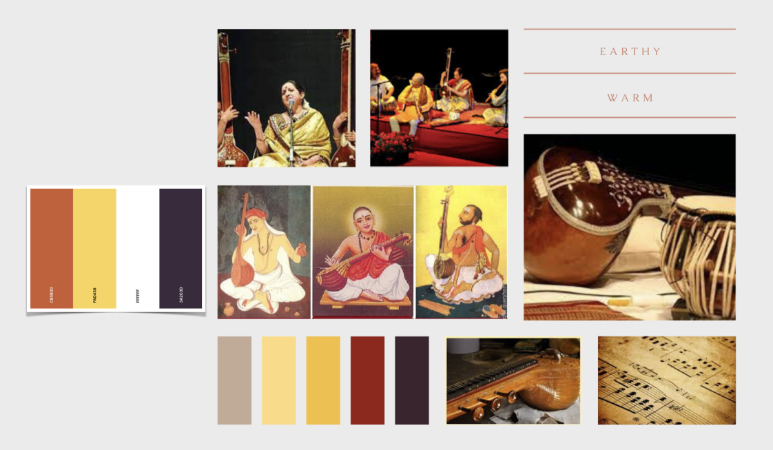
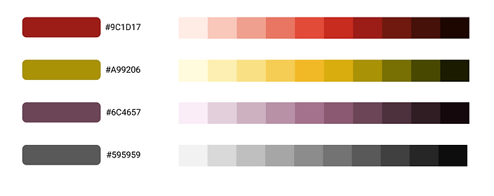
Based on our research, it was analyzed that the existing color scheme of the app was well received by the elderly users but not by the rest. By considering the former branding, we tried bringing in new colors that were fresh but also evokes a feeling of familiarity thereby catering to all the users.
Typography
We wanted a font that blends along with the warm nature of the app, a font that gives a pleasant appeal.

Conclusion: We made a design system by defining the color palette, font and type scale, spacing units, border-radius units, artboard grid, and effects that we are to use as the project progresses.
Ideation
We began by conducting brainstorming sessions and congregating ideas and suggestions on various aspects such as the Onboarding experience, Navigation, Course and Media discovery, etc.


Wireframe Sketches
Once we were able to conclude the brainstorming session, we started working on sketching various ideas for the interface based on what we have grasped so far.
Onboarding
Sketches showing the onboarding experience for new users.
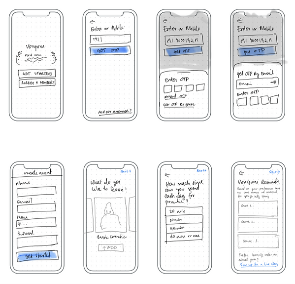
Onboarding experience for pre-existing/ returning users.

Key Modules
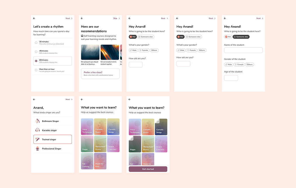
To devise a personalized learning plan we asked the users :
1. Their overall goal for taking the course - ( is it for learning fresh? or have they learned it before and just want to brush up?)
2. How much time can they spend each day?
Accordingly, we devised a daily agenda for them, which includes main videos, practice videos, repeats, and revisions. By doing this we can easily expand it to many hours of learning. But the challenge we faced here was that we needed an answer on how to automate the daily agenda if the number of variables was high.
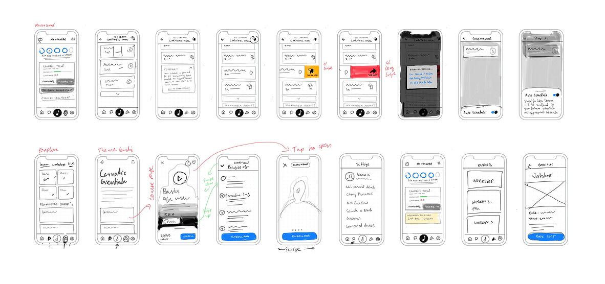
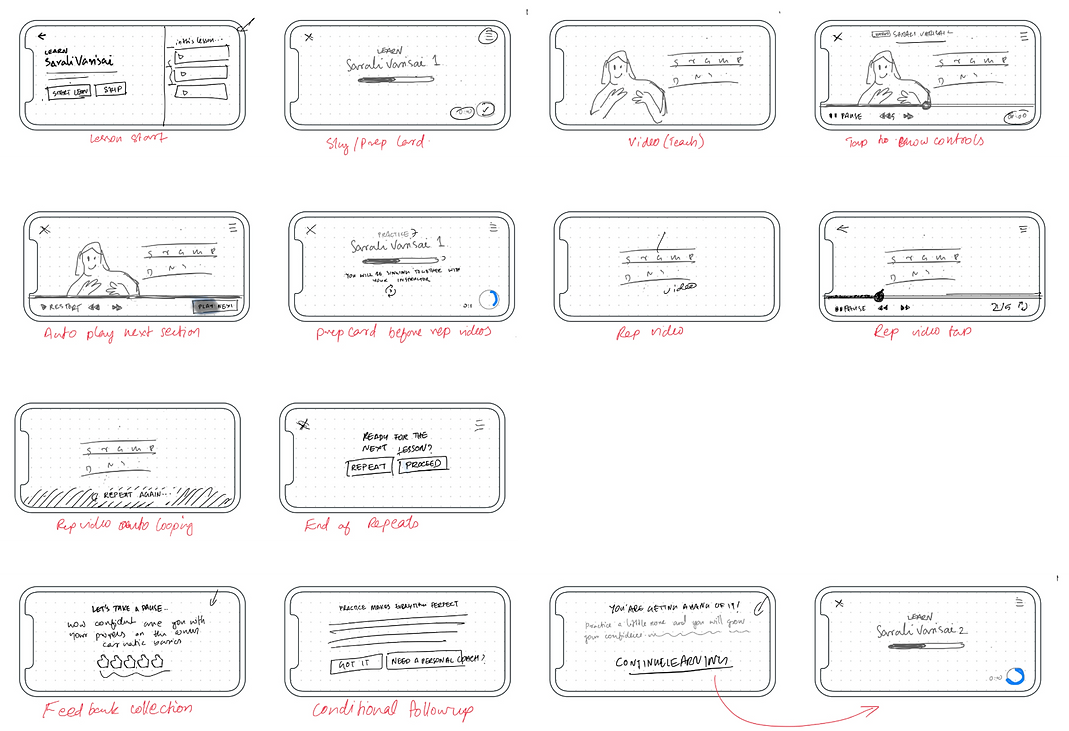
Landscape - Lecture Videos
We needed to revisit the way practice lessons were shown. Currently, it was in a video format. They contain 2 components -
1. audio of the exercise
2. the notation that's displayed according to what's happening in the audio.
A few questions to ask -
1. whether the video is the ideal format for the practice lessons or can we differentiate.
2. Can the main lessons alone be videos and practice lessons be lighter - for example - audio+image format.
3. Can we delink the audio & image so that we can also come up with goals?
Keeping this in mind, we formulated a structure that was close to a real-life music learning experience which also helped us elongate the lessons with the same content:
1. First few days we ask them to sing with the audio+notes.
2. The next day we remove the notes and ask them to try and sing from memory.
3. Following day we remove the audio and show only the notes.
4. Finally, we remove both and ask them to try on their own.
Final UI Design
After numerous iterations based on trial and error and feedback from the client and developers, we were able to conclude the sketching session and move on to designing the high-fidelity mock-ups.
Signup/ Login/ Retrieve password
One challenge we faced in this stage was, Voxguru had different subscription plans for users based on their country. So we needed to implement a system that could inform the back-end about the location information while providing a seamless experience to the users.

Onboarding Experience
Here our main objective was to instill a sense of responsibility and trust among the learners. We wanted to let them know that Voxguru will fondly guide them through their music-learning journey.
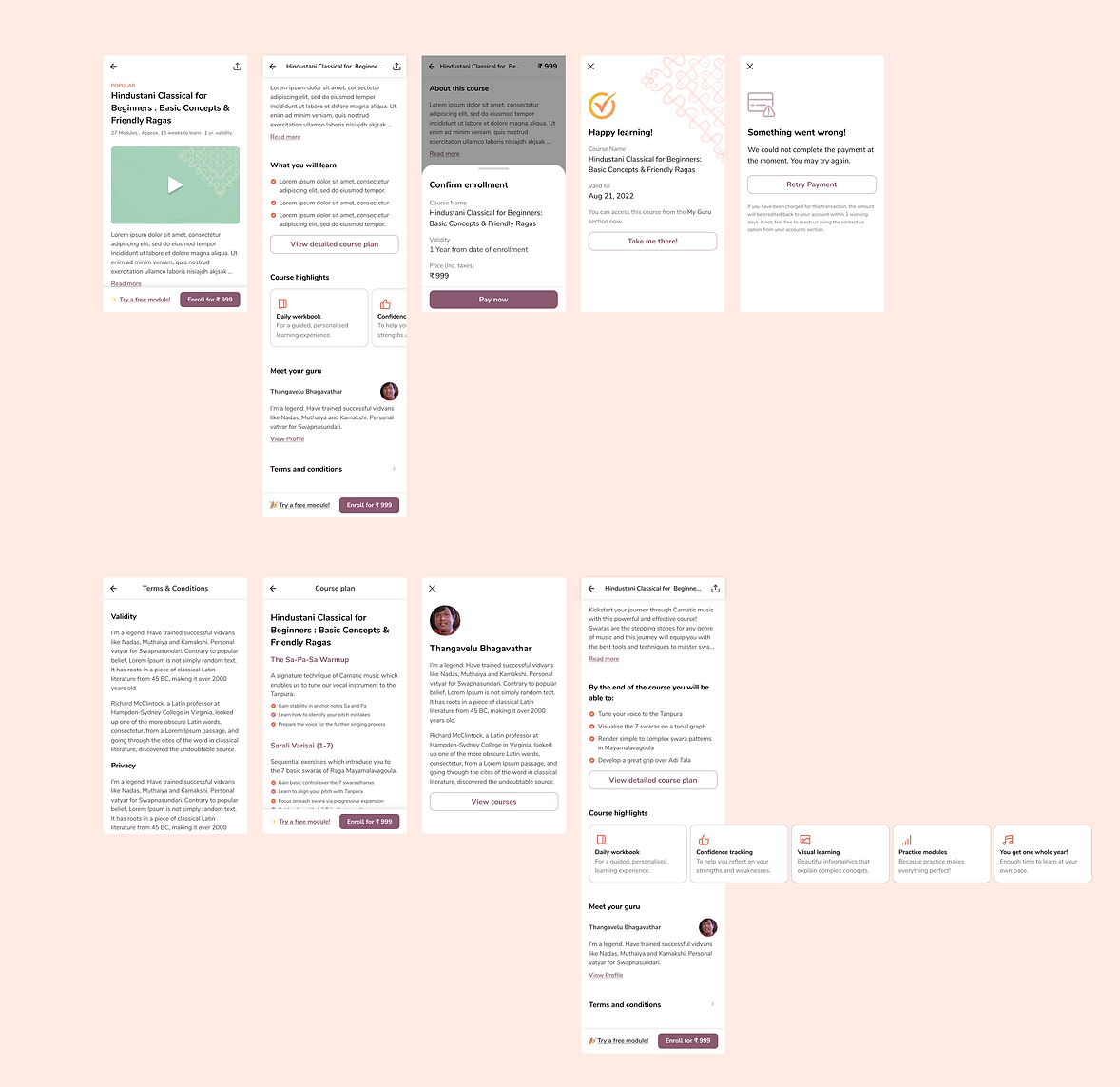
Home and Course Discovery
Recommendations based on the onboarding choices come at top of the content hierarchy on the home page. Courses are also categorized based on popularity, genre, etc for effortless discovery and navigation.

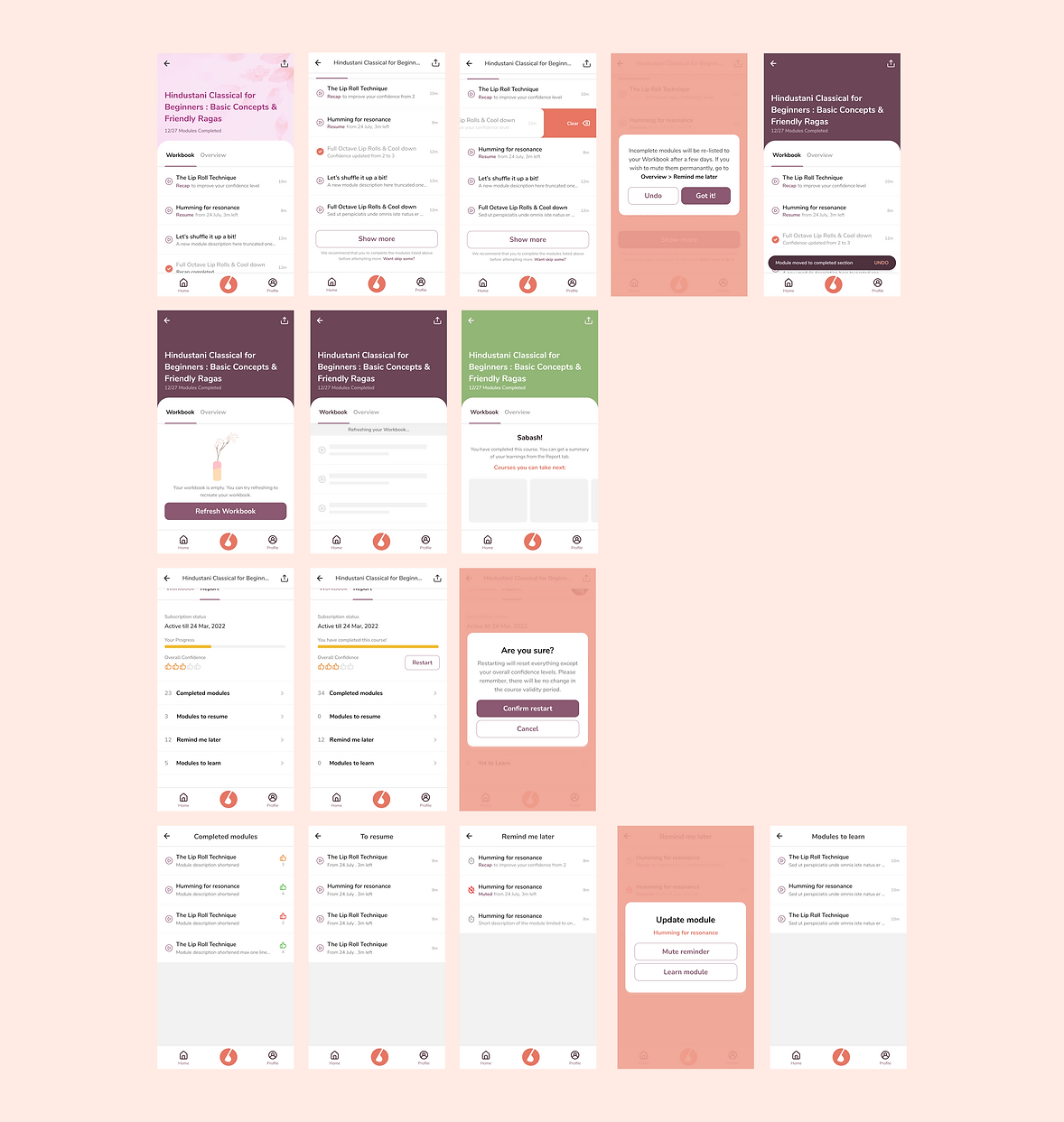
My Voxguru
This is a personalized learning area. The courses enrolled by the students appear here. Furthermore, daily routines are provided in the course workbook to encourage them and keep them going. The confidence scale helps them to keep track of how much they've absorbed from each class.

Course workbooks were carefully planned to give the users a flawless learning experience that matches the mood of Voxguru.
Enhanced Learning Modules
For a real-to-life experience, the student needs to be in a relaxed sitting position where she/he can perform 'Thala' while singing the notes. The landscape format helps in achieving this goal along with minimal interactions. The video modules consist of different stages which include 'Listen and repeat' and 'Sing together' sessions where the user practice till their confidence level rises to an adequate level.

For an even enhanced experience, the mobile screen can be mirrored to a larger desktop or even a smart television screen.

Account Information
Features like editing personal information, security details, billing details, invoices, FAQs, and logout etc are provided here.

Final Product
Feel like taking a peek at what we designed? Go to the links below!
Playstore link:
https://play.google.com/store/apps/details?id=com.voxguru&hl=en_IN&gl=US
Appstore link: